
Thanks, Trump!
The businessman—or is he a politician?—stands akimbo, hands tucked into the pockets of a fine three-piece suit. His vest is tight across across the middle, button holes stretched wide. Above the starched collar and bow tie, a sack of money bursts forth.
Drawn in 1871 by political cartoonist Thomas Nast, the cartoon depicts Boss Tweed, the famously corrupt 19th-century politician who defrauded New Yorkers of millions of dollars. Nast’s art was a thorn in Tweed’s side. “I don’t care so much what the papers say about me,” Tweed once said. “My constituents don’t know how to read, but they can’t help seeing them damned pictures!”
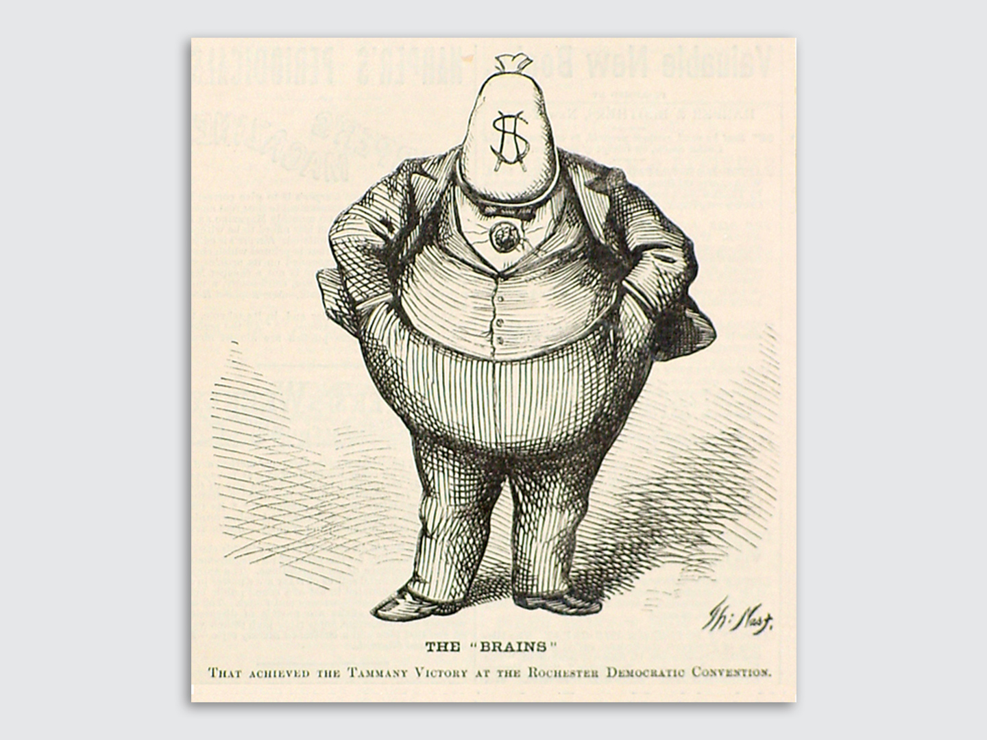
Tweed’s 150-year-old words feel oddly prescient today. Trump supporters may not read the same news as those who oppose the president, but we all see the same “damned pictures.”
The 2016 election and new administration come accompanied by a renaissance of political image-making: The release of new cover art by magazines like Der Spiegel and Time are met with thousands of shares and retweets. Each photograph and illustration is analyzed and picked apart by commentators. And fomenting all of this is a protest movement with a flair for signage that remixes, reappropriates, and borrows the work of these artists.
Not since George Lois’s iconic work for Esquire in the ’60s has cover art enjoyed so much popular and critical success. It’s a fascinating time to be an illustrator, designer, or painter working on political subjects. Co.Design asked some of the voices and pens behind today’s iconic cover art about their work—and what’s changed in the past three months.
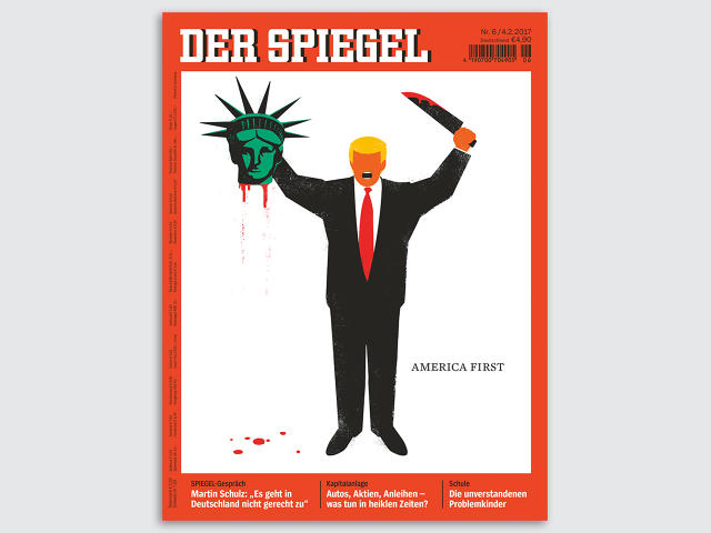
“DER SPIEGEL,” FEBRUARY 2, BY EDEL RODRIGUEZ
“I think this kind of work helps people understand and communicate ideas in a way that reading and writing about the issues doesn’t,” writes Edel Rodriguez, the Cuban-American artist, who fled Cuba as a refugee in 1980. “Images give people something to rally around and show to others.”
Several of Rodriguez’s images of President Trump became instant classics over the course of the election; their saturated, stencil-style graphics lend themselves to the intensity of political debate today. The latest of these, published by Der Spiegel, featured the president, machete in hand, wielding the bloody head of Lady Liberty. When it was published in February, it inspired intense debate over the implicit comparison between Trump and terrorism.
The image actually started out as a graphic Rodriguez posted online—something he does frequently when an idea strikes—which eventually made its way to Der Spiegel’s editors. You can usually spot Rodriguez’s images super-sized as protest signs; he retweets images of his work being used this way, and before the inauguration created a special stencil for protestors at the Women’s March on Washington. At the President’s Day rallies that took place over the weekend, at least one protester simply printed out Der Spiegel’s cover and turned it into a massive sign.
“For me it comes from a visceral place, much of it informed by my own history as an immigrant and a refugee,” Rodriguez explains. “I feel I have to and want to make this work. It’s really a personal decision to get involved, and I love seeing all the work that’s popped up . . . If my work can help the discussion move forward then I feel I’ve done my job.”
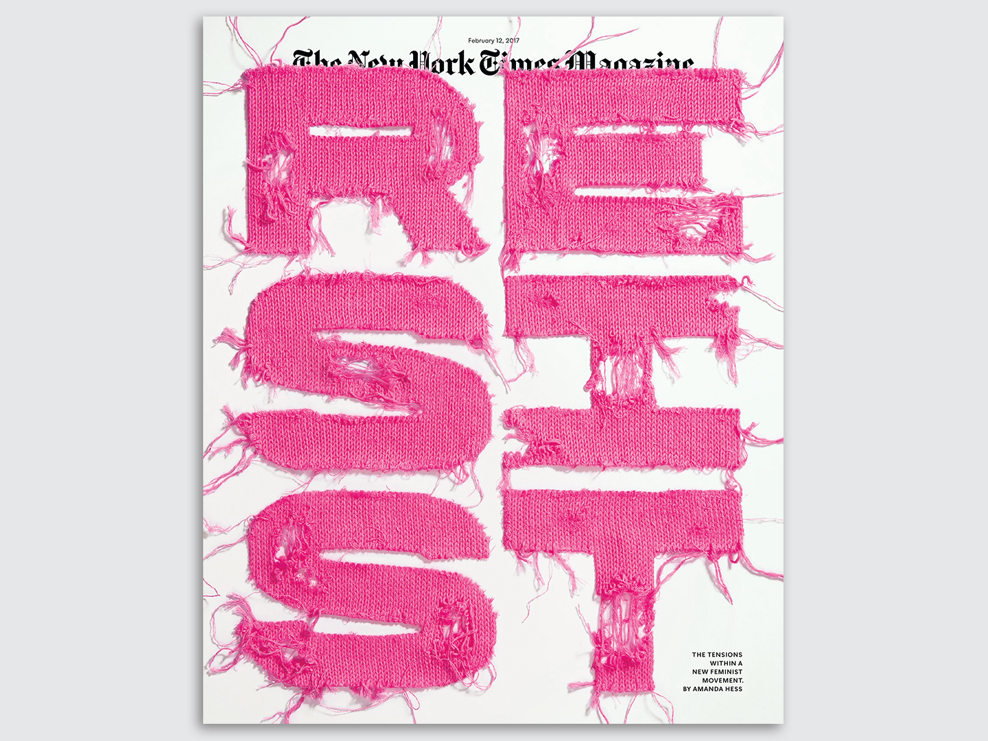
“NEW YORK TIMES MAGAZINE,” FEBRUARY 12, DESIGN BY GAIL BICHLER, TYPOGRAPHY BY JESSICA WALSH
Gail Bichler, design director of the New York Times Magazine, writes that political engagement is high, and strong reactions to the magazine’s art reflects that. “Beyond the comments they send us, I notice readers posting their own pictures of the covers on social media with their opinions, and readers are even expressing interest in having our covers made into art for their walls,” she writes over email.
To accompany Amanda Hess’s recent cover story about the history behind the Women’s March on Washington, Bichler conceived of a cover that reflected the tension inherent in the movement:
The type made of yarn was one of several ideas that I pitched to my editors. Hess’s story delved back into the history of feminism from its roots to the present in an effort to understand who feminists are, what they stand for, and the current movement’s prospects for leading the anti-Trump resistance. We wanted to make sure that the cover image telegraphed that the piece was about more than the current moment. If you show an image of the iconic “pussy hat,” the cover is all about the 2017 march. I liked the idea of referencing the hats rather than depicting one. Knitted type could have looked twee or like a craft project rather than a strong statement in the wrong hands. Jessica Walsh and her team did a fantastic job, creating tension between the softness of the knitting and the bold aggressive type.
While some of the magazine’s covers certainly portray political opinions, Bichler points out that even the art has to reflect the magazine’s standards of impartiality:
The Times has ethical guidelines about covering politics impartially, and those standards extend to visual journalism. It may seem counterintuitive on some levels given the current political climate and call for activism, but now more than ever the organization as a whole needs to follow those guidelines so that our readers can trust our reporting. We are, however, doing many more political stories than we have in the past and have a slightly different mission than the paper. We often publish pieces in which the writer’s voice drives the narrative, and that perspective is reflected visually on our cover.
Like many of Rodriguez’s pieces, the “Resist” cover has already made it out into the real world in ad hoc form.
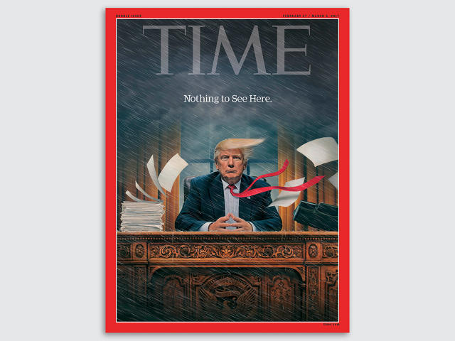
“TIME,” FEBRUARY 27, 2017, BY TIM O’BRIEN
The painter and illustrator Tim O’Brien echoes something that Thomas Nast and Boss Tweed clearly knew: That political imagery can often travel further than words. “I think images provide a common rallying point, and one doesn’t have to read a poster or post to understand them either,” he tells Co.Design over email.
O’Brien’s recent cover for Time has Trump seated at the Resolute desk in the Oval Office, hands steepled, glaring at the camera as a gale force wind whips the entire scene to one side. The only text? “Nothing to see here.”
TIME’s new cover: Inside Donald Trump's White House chaos https://t.co/hctIFEcOSG pic.twitter.com/1hSQNrY6JQ
— TIME (@TIME) February 16, 2017
Meant to visualize the chaos and long storm of scandals that have plagued the White House this month, the idea came via email from Time’s design director D.W. Pine, O’Brien explains in a short video about the process. His precise, super-realistic painting style lends itself to the tableau perfectly: It could be a presidential portrait, but for the rain clouds looming over the yellow coif. The final painting was animated by the magazine as a sharable GIF, with Trump’s tie whipping around in the wind.
After decades making cover art and paintings of political figures, O’Brien explains that some politicians simply give magazines more to work with. “As far as cover art goes, Clinton and Bush both had rich and textured presidencies and thus provided many illustration opportunities,” he writes. “Obama was a calm, steady leader with no dramatic foibles that required artistic analogies to explain them.” And Trump? He’ll be “a source of many illustrations.”
This article first appeared in www.fastcodesign.com
Seeking to build and grow your brand using the force of consumer insight, strategic foresight, creative disruption and technology prowess? Talk to us at +9714 3867728 or mail: info@groupisd.com or visit www.groupisd.com


