
A series of New York Times visualizations reveals how geography is the strongest connector, regardless of where you live.
Facebook was supposed to connect the world: Mark Zuckerberg’s favorite map of Facebook connections lights up every corner of the globe, making it appear as if Facebook has brought everyone together in some kind of digital utopia. But a new study by economists at Harvard, Princeton, NYU–and Facebook itself–shows something else entirely. People remain closest to those who live in their own backyard.
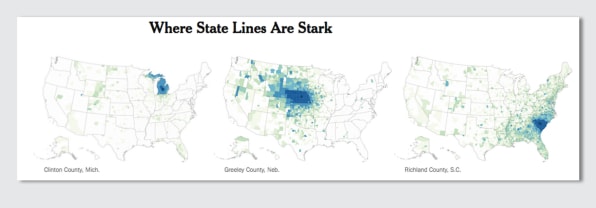
In a visualization, the New York Times maps these distance-based connections visually, using anonymized Facebook friendships as a proxy. Hover your mouse over the interactive map and it will show you the relative probability that someone in the county you clicked on is Facebook friends with someone in every other county in the country. While there’s a lot of variation, the map shows that people all over are mostly connected to the people who live near them, regardless of political affiliation or demographics.
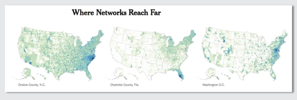
There are some exceptions–counties that have military bases and Washington, D.C., for instance, are more tied to places all over the country than Lincoln County, Wisconsin, where people are connected more locally. In the map, you can see the traces of history, like movement patterns during the Great Migration when African-American laborers moved from areas around the southern Mississippi River up north to Illinois and Wisconsin. There’s also places that are more isolated from the rest of the country than others: Kentucky is home to 6 of the top 10 counties in the U.S. with the biggest number of friends living within 50 miles.
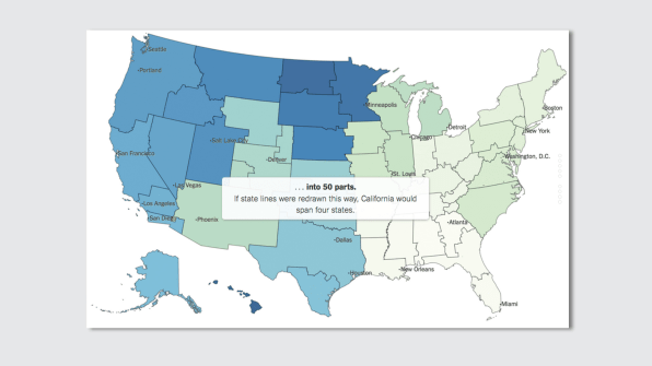
When the country is redivided into 50 regions based on how closely connected each county is on Facebook, which the Times dubbed the “social media states of America,” you can see a semblance of some states–indicating how strong of an influence state affiliations are in people’s lives–but other areas have been divided up completely, like California. In the social media states of America, the golden state has become four discrete states, while Arizona and New Mexico have almost merged.
To some degree, connectedness has a positive impact. Counties where people are more connected to others around the country tend to have more money, higher levels of education, and even live longer. But the Times‘s map makes visible that despite these discrepancies, connection still remains predominantly dictated by geography. In that sense, we’re not so different after all.
–
This article first appeared in www.fastcompany.com
Seeking to build and grow your brand using the force of consumer insight, strategic foresight, creative disruption and technology prowess? Talk to us at +9714 3867728 or mail: info@groupisd.com or visit www.groupisd.com


