
When working with large amounts of data, precision is key. The same is true of the art of data visualization: size, shape, shade, hue—the tiniest details of a visualization can radically alter how information is perceived and understood.
Which is why color is an important aspect to consider (read: obsess over) when it comes to information design. “The overarching lesson for data design is that the color is there to help you understand the data,” says Maureen Stone a color expertand research manager at the data visualization company Tableau. “It’s there as a visual cue for what the data means. So I always tell designers the first thing they need to do is figure out what is the color doing? What is its function?”
Stone’s job is to work with information designers at Tableau to create and chose the best colors for data visualizations. She runs a lab within the R&D arm of the company that is dedicated to researching color specifically as it relates to data. Lately, they’ve been applying their color research to creating the color palette options in the latest version of the company’s data viz software,Tableau 10.0.
When I ask Stone over the phone what type of function color might have in terms of data visualization, she points out a few common ones: Is it being used to discriminate between categories? Or is it assigning value along a scale, using different shades of the same color to indicate more or less of something? Perhaps its only function is to serve as an unassuming background color against which color-coded categories can “pop.”
Determining the function is a first necessary step, but that decision opens up a whole world of more specific choices that can profoundly impact how the visualization is perceived. Here are the most important considerations, according to Stone.
Due to a color’s chroma—or measurement of colorfulness by dimension—it can look different at different sizes.
SEMANTICS, SEMANTICS
One of the key things to keep in mind when choosing color for a data visualization is making sure the colors are “semantically resonant,” as Stone puts it, with the data they are representing. Put simply, that means that designers need to pay heed to the relationship between a color and the thing that the color is being used for.
A simple example of this is a bar graph comparing the price of vegetables. Rendering the broccoli bar in green and the corn bar in yellow is consistent with our color-food associations. Switching the colors—so that broccoli is represented by yellow and corn is green—would be confusing. Another very common example hails from heat map-style graphics, like this one made by Trulia to visualize commute times, where red is associated with negative conditions and green or blue are associated with the positive. Context counts, too. If you’re charting this quarter’s earnings from the computer giant Apple, you’d do well to color the data gray to correspond with the brand and its shiny devices, rather than the red or green associated with the fruit.
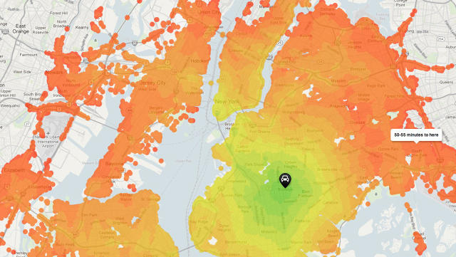
In heat map-style graphics, red is associated with negative conditions and green or blue are associated with the positive.via Trulia
Some concepts, of course, aren’t strongly associated with a particular color. Designers might interpret that as an opportunity for free creative reign, but Stone sees it as a chance to use data to dig deeper under the surface level of our word-color associations. As part of a research project from 2015, Stone and fellow Tableau research scientist Vidya Setlur came up with an algorithm that generates “semantically meaningful colors” by measuring color name frequencies from Google n-grams, then retrieving a representative color from Google Images.
An n-gram search for the word “yellow,” for example, comes back with a strong association with “taxi,” among others. A Google image search for taxi, meanwhile, will bring up photos of various colored taxis (some newer cabs in New York, for example, are lime green) but with a higher percentage of yellow cabs. Stone and Setlur created an algorithm that “clusters” all of those images together and comes up with the strongest color match: in this case, a bright yellow.
Even if you don’t happen to have your own linguistic color algorithm, you can usually deduce if there is a correlation from between concept and color. It’s only smart to use it.
The graph on the left shows colors mapped out in color space. The colors that are close together, like green and yellow, are also perceptually similar.Tableau
BE DISCERNING
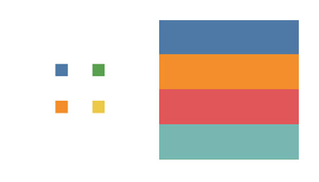
When it comes to colors used for data science, you need to discriminate: The colors should be different enough from one another so that they’re easy to tell apart in a visualization. When choosing colors for data, Stone maps them out using color space, or a modeling tool that shows the full range of colors. If the colors are close together in color space—green and yellow are right beside each other, for instance—they’re also perceptually close. And it’s best not to use two colors that are perceptually close together in a data viz.
One real-world example of this idea comes from a 2015 infographic showing the most comprehensive “tree of life” to date. In it, thousands of lines on a graph represent every known species on earth—from the most basic bacteria to the most complex of metazoa. To give a very detailed glance at the evolution of life in a comparatively tiny graph, the researchers behind the project seemingly chose the colors to contrast with one another. The red of bacteria is beside the blue of metazoa—two colors on the opposite ends of the color spectrum. The colors help to clarify the huge amount of data.
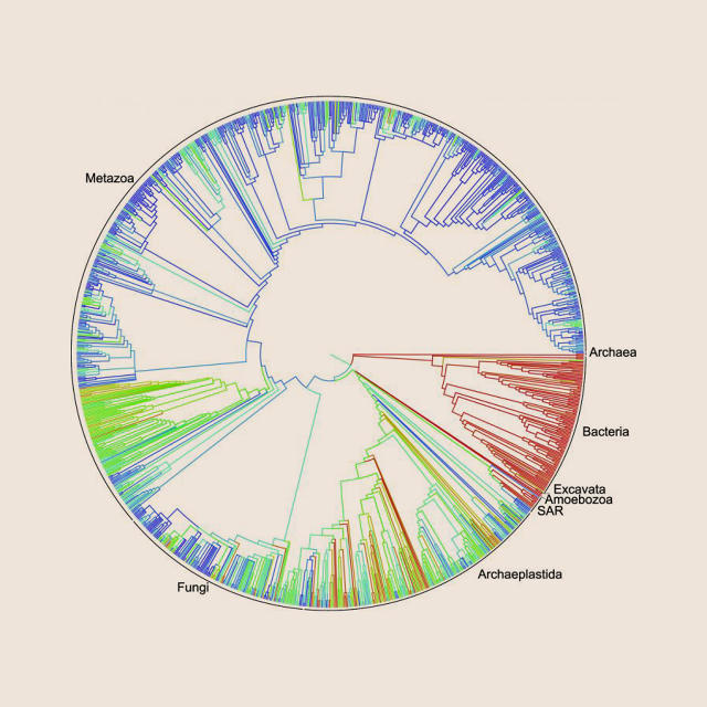
This “tree of life” graphic clarifies a large amount of data by using colors that are visually distinct from one another.via opentreeoflife.org
SIZE MATTERS
When choosing or creating color for data, Stone says it’s important to remember what she calls the “paint chip effect.” Logically, if you want to paint your wall a bright yellow, the color you choose is going to look much brighter once it’s covering an entire room than it does on a little paint chip. Similarly, a color will look different as a tiny block on a map legend than it does covering an entire state on a map.
“What we discover is as you see colors at small sizes they become less colorful,” Stone says. The variable here is the color’s chroma, or measurement of colorfulness by dimension. An electric blue racing stripe, for example, has a high chroma, while a muted grayish-blue has a low chroma. When used at a smaller size, the chroma for the latter would need to be increased so that it’s bright enough to be distinct. The electric blue, when enlarged, would need a slightly decreased chroma so it doesn’t “yell at you,” as Stone puts it.
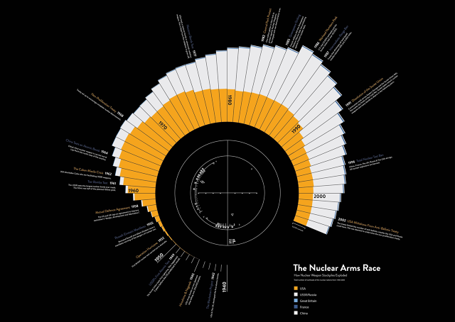
This infographic about the amount of nuclear weapons in the world is rendered in yellow, black, and white—negative colors to match a sober subject.u/drwtsn via Reddit
COLORS HAVE AFFECT
It’s no surprise that colors can evoke emotional connections—blues and purples are perceived as more pleasant than yellows, for example. Bright green can be seen as aggressive or playful. As Stone puts it, “everyone in the design realm knows that color has affect, and they have examples and rules” based on that knowledge. “One question is: Even on a bar chart, does that count?”
The answer, according to Stone, is yes. In conjunction with researchers at Simon Fraser University in British Columbia, Canada, she conducted a study that asked people to color bar charts so that they conveyed certain feelings, like calm, playfulness, or negativity. Their research showed certain patterns: People selected more muted colors for a calmer bar chart and brighter colors (high in chroma) for a playful chart. Meanwhile, they chose dark colors to convey negativity. Using this information to color charts in a way that is consistent with the data can emphasize the message being conveyed.
Coloring a chart in a palette that induces calmness may not be as functionally important to data visualization as color distinctness or semantic correlation. But considering all of these factors together will help people absorb and understand data more easily, Stone says. Designers may think that their use of color is meaningless, but it could have emotional side effects that influence how readers understand the data. Take this infographic visualizing the number of atomic weapons in the world in a given year. The designer, Reddit user drwtsn, chose the colors yellow, black, and white—colors commonly associated with negativity—instead of a pleasant palette of mint green and robin egg blue or the bright reds or intense oranges you might associate with nuclear war.
As Stone shows through her research, the fascinating science behind color theory isn’t dulled by the cold mathematics of big data. Instead, it marries art and science in a way that is both functional and aesthetically pleasing.
This article first appeared in www.fastcodesign.com


