The Economist calls Santander Bank the “king of the Eurozone” while British magazine The Banker crowned it “Global Bank of the Year” for 2017. The data supports the judgments of both publications. With more than 133 million customers worldwide, Santander’s brand is valued at EU €5.6 billion (USD$6.87 billion), making it one of the world’s 100 most valuable brands in Interbrand’s latest Best Global Brands report and establishing it as one of the most valuable financial brands in the EU.

Santander’s success is highlighted in the latest Best Spanish Brandsreport by Interbrand, which ranks it the third most valuable brand in the country. The company’s value stems from “its business model, unique in the sector due to the predictability of its growth, as a result of its good management and its care with profitability and efficiency, as well as its geographical diversification.”

Santander Bank has weathered the global economic crisis and adverse scenarios that have arisen in the countries in which it has a presence by following a maxim—“adapt to changes.” An entity with more than 160 years of history does not survive if it does not embed evolution in its DNA. Led by Executive Chair Ana Botín, Spain’s largest bank is facing urgent and looming challenges including digital transformation; adapting to how younger consumers relate to brands in general—and to banks in particular—as opposed to how Generation X and Baby Boomers did; and the need to communicate globally as a single brand, offering a unified yet differentiated, meaningful and well-aligned experience to its different interest groups locally and regionally.

Botín’s appointment as the bank’s chairwoman marked the beginning of a transformation that has laid the foundations for the new Santander brand. Under the guiding principles, “Simple, Personal and Fair,” the company is transforming its way of being and acting from within in order to offer its audiences a banking experience that is aligned with its purpose: to contribute to the progress of people and businesses.
A brand prepared for a digital future
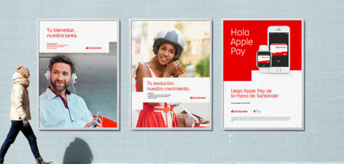
The changes taking place internally and externally, and in the behavior of the brand, are expressed in its new visual identity. During its recent annual shareholders meeting, Botín unveiled the new brand strategy, born from its essence, its promise and its values, enabling the brand to adapt to all markets and all environments, with communications to be unified, global and local, at the same time.
There were two driving forces why we decided the brand needs an update. One, technological. Our brand must work in an ever more online and mobile world. Secondly, we need a brand to reflect the bank's cultural transformation.https://t.co/vL0ALvuoND
— Ana Botín (@AnaBotin) March 23, 2018
 Santander Bank is not facing a revolution, but rather an evolution. Leveraging a common understanding of the brand, and its strongest existing assets, it has embraced a broader visual universe that will allow it to transcend all borders while maintaining its nature and coherence.
The logo’s signature flame and the name “Santander” remain at the center of its visual identity to preserve the brand’s legacy, while both elements have been modernized and digitized to inspire openness and closeness, and enable it to adapt to different contexts and channels.

Perhaps one of the most perceptible changes for audiences has been that of its wordmark. The new visual identity features a unique typography to reflect the values that have motivated the brand’s transformation and speak to the dynamism of a company that knows how to evolve.

The bank’s hallmark red color has also been revitalized and standardized to elevate the brand’s visibility in different environments and settings. Now it is brighter, seamlessly reinforcing the brand’s identity inside and outside of the ecosystem, online and offline. It complements the color white, designated as the main color, creating a more balanced, relevant, and efficient user experience.


The key assets of the identity have been revamped and reinforced with additional tools and resources, including a new secondary color palette, pictograms, illustrations and a distinctive photographic style. This visual language and toolbox give the brand the ability to flex and communicate in a consistent and relevant manner globally and in each of the countries in which it operates.

The new identity creates the foundation to turn Santander into an open platform of financial services, connecting different players under its technological umbrella. Thus, the business strategy and brand strategy are connected with the same goal of engaging the customer. The new platform fosters connections and enriches customers’ experiences by leveraging digital and facilitating closer, more flexible and open relationships on a day-to-day basis.
The bank that thinks about customers. This is the new Santander. Simple, personal and fair.
–
This article first appeared in www.brandchannel.com
Seeking to build and grow your brand using the force of consumer insight, strategic foresight, creative disruption and technology prowess? Talk to us at +9714 3867728 or mail: info@groupisd.com or visit www.groupisd.com


